Project 4 required us to compose an abstract video with the incorporation of an audio. When thinking over the auditory component, I knew that I wanted to do an instrumental piece. I found some jazz pieces that I really enjoyed that spoke to my favorite genre, R&B. While I had the music selected, I did not know what exactly I wanted visually. I decided to look back at the storyboarding and found a few pieces that spoke to me. I, personally, felt that the storyboarding had a very different feeling when implementing it on paper versus After Effects.
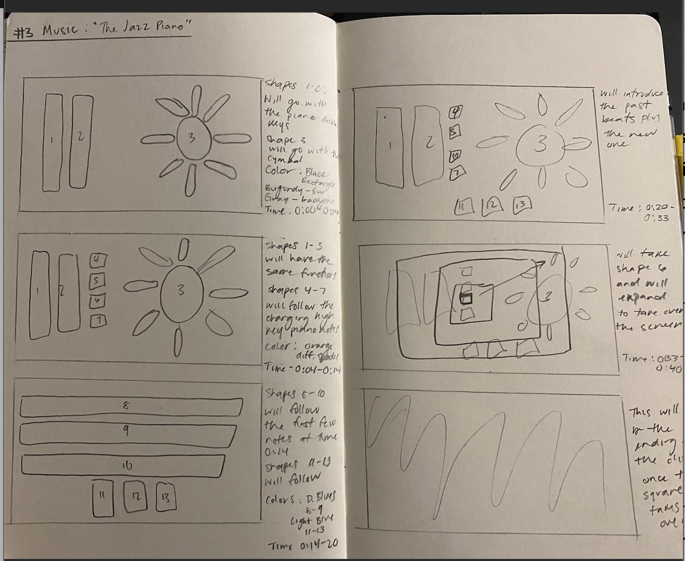
Therefore, I went with what I found represented the music at moment of working with the program. This approach seemed more freeing than attempting to follow the sketches made within the storyboarding. I decided to find artist that did something similar, and I found the artist Wassily Kandinsky. He created the piece “Impression III (Concert).” This piece originated from a concert he attended while at Munich, Germany. In other words, the art emerged as a result to the music being played. While this is the opening sentence/quote from the reading, I find that it speaks to the difficulty of attempting to visually represent a sound successfully.
“Music has for a long time played a role within the visual arts. But the method of turning beautiful sounds into a painting has not been easy to find. Many have tried, but few have been successful.” [1]
They discuss how painters usually come to paint on the instruments or physical components of the creation of music rather than the emotional connection. I found this rare as I had the assumption that most artist would come to have the intent to translate music into a visual. However, I can see how painting performers, or the instruments is another stylistic approach to the creation of art.
Beyond this artist, I was able to find an article that showcases and discusses famous painting that have been recreated through geometric shapes. When I first clicked on the link, I was hesitant. However, the pieces that were found were so fun. The recreations include that of the “Girl With a Pearl Earring,” “The Kiss,” and “Mona Lisa.”[2] While my piece is not a painting forms of a human being or a landscape, it utilizes basic shapes to attempt to speak to my visual connection to the song. Now, I had to select colors. The article “Color: How It Changes the Mood in Art” was a good introduction to the way colors can impact the perception of a piece.[3] I say this as it displays various art pieces and provides a descriptor on each piece regarding the impact the artist’s color use comes to have on the viewer. I personally like Thomson No. 13 (Northern Lights), by Douglas Coupland. He uses muted vibrant colors which brought me to a sense of joy and relaxation something that I wanted my piece to do but not to the same extent.
Once I had some of the visual aspects of my video, I decided to review the rule of thirds by reading an article by Jessica Stewart. This article like the other sources applied their explanations to painting to provide a visual example to the reader, something I find useful. I quote that I kept reminded myself when placing shapes is:
“Anyone who deals in producing visually appealing work will have had this golden guideline pushed on them in order to achieve a balanced composition.”[4]
I understand that I am not a professional artist and that I am still learning techniques and the execution of ideas. Therefore, this was a friendly reminder to check my work to ensure that I am attempting to apply the rule. Nevertheless, I am also trying to remind myself to have fun with it and try not confine myself to a set image because as the artist Jaq Chartier said:
“I think that idea comes from a black and white way of looking at things—that if you’re focused on making something beautiful it’s not going to be creative, it’s going to be craft.”[5]
[1] “Impression III (Concert) by Wassily Kandinsky,” accessed April 11, 2022, https://www.kandinskypaintings.org/impression-iii-concert/.
[2] Margherita Cole, “Famous Paintings Reimagined as Fun Illustrations Made With Geometric Shapes,” n.d., https://mymodernmet.com/john-battalgazi-geometric-illustrations/.
[3] “Color: How It Changes the Mood in Art,” Google Arts & Culture, accessed April 11, 2022, https://artsandculture.google.com/exhibit/color-how-it-changes-the-mood-in-art/XgKSfPrv2f5sIQ.
[4] Jessica Stewart, “Quick Guide to the Rule of Thirds for Artists and Photographers,” accessed April 11, 2022, https://platform.tumblr.com/v2/follow_button.html?type=follow&tumblelog=mymodernmet&color=blue.
[5] “Artist Jaq Chartier on Overcoming Art Career Challenges,” Artwork Archive, accessed April 11, 2022, https://www.artworkarchive.com/blog/artist-jaq-chartier-on-overcoming-art-career-challenges.
Bibliography
Artwork Archive. “Artist Jaq Chartier on Overcoming Art Career Challenges.” Accessed April 11, 2022. https://www.artworkarchive.com/blog/artist-jaq-chartier-on-overcoming-art-career-challenges.
This source is an interview with the artist Jaq Chartier. She discusses the challenges as an artist while simultaneously providing advice to overcome them. This piece allowed me to understand that confining yourself to image is not idealistic. It is when you deviate that your art becomes better.
Cole, Margherita. “Famous Paintings Reimagined as Fun Illustrations Made With Geometric Shapes,” n.d. https://mymodernmet.com/john-battalgazi-geometric-illustrations/.
This source provides the recreations of famous paintings using simple shapes. It is a great example to the detail one can add while sticking to basic shapes.
Google Arts & Culture. “Color: How It Changes the Mood in Art.” Accessed April 11, 2022. https://artsandculture.google.com/exhibit/color-how-it-changes-the-mood-in-art/XgKSfPrv2f5sIQ.
This source provides a quick overview on the way that color can come to impact the overall sensation of your composition. This is a great source to look at as they provide different paintings and break down how the color comes to impact the viewer.
“Impression III (Concert) by Wassily Kandinsky.” Accessed April 11, 2022. https://www.kandinskypaintings.org/impression-iii-concert/.
This is the first painter that I found that took a similar approach to mine. Once I read their process, I was able to connect with their piece better.
Stewart, Jessica. “Quick Guide to the Rule of Thirds for Artists and Photographers.” Accessed April 11, 2022. https://platform.tumblr.com/v2/follow_button.html?type=follow&tumblelog=mymodernmet&color=blue.
This source was a refresher to the readings assigned in my Art 111 class. It provides us with the definition and application of the rule of thirds.

Leave a Reply